
Petpeeve #1: Apple maps search UI
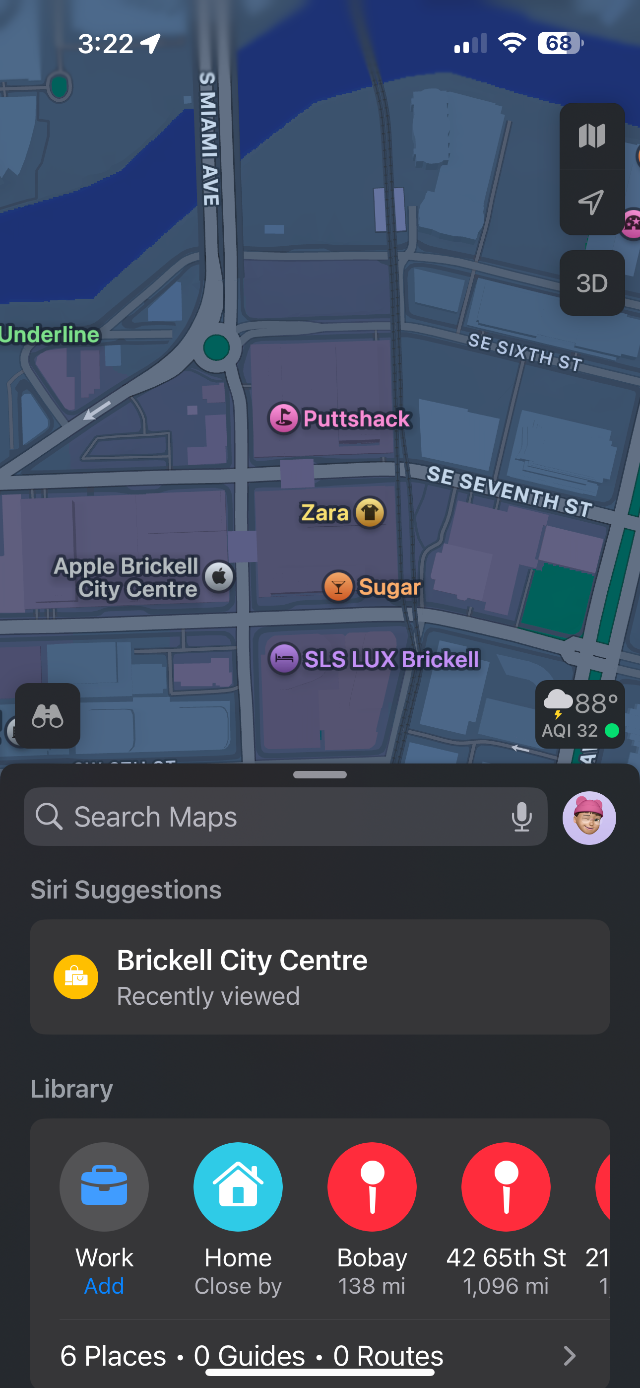
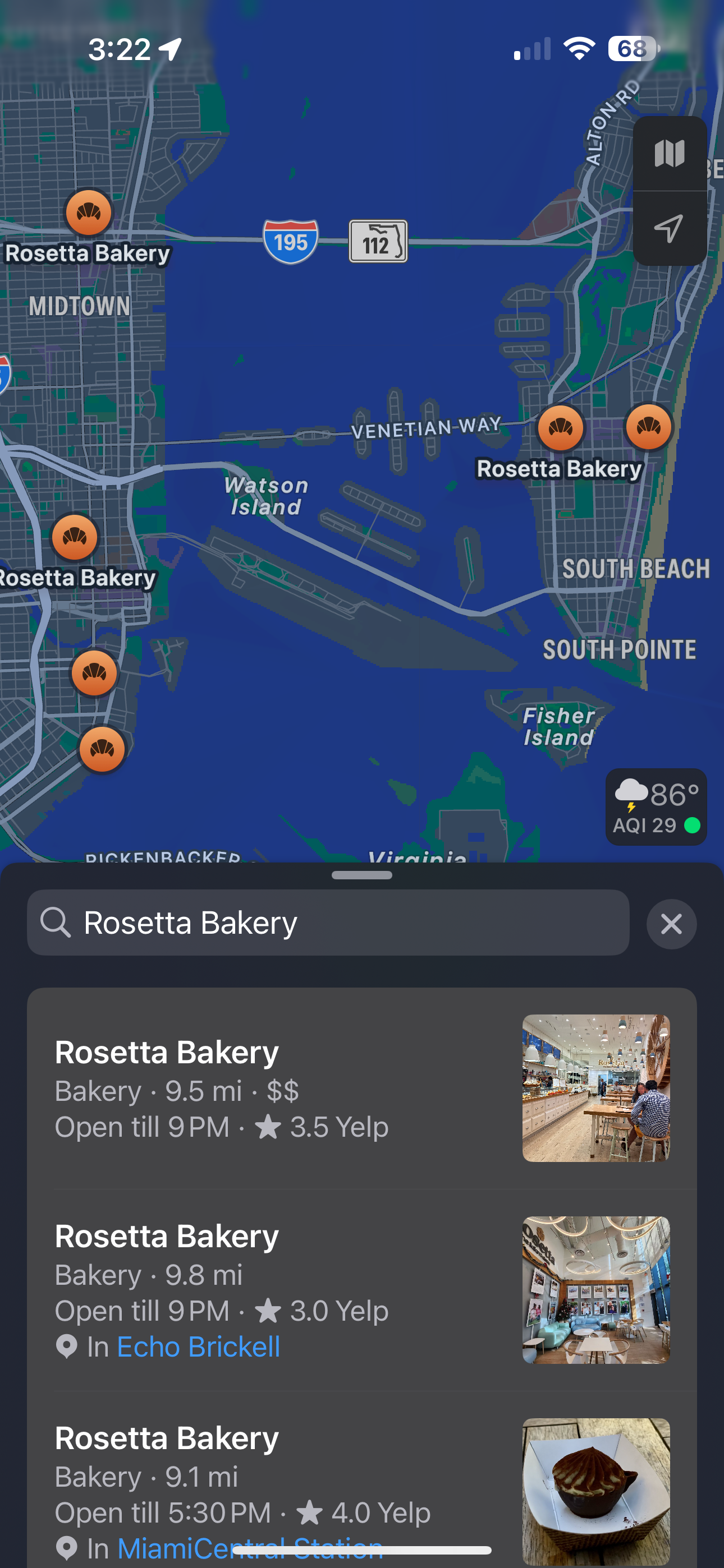
Users of Apple Maps experience unnecessary friction when interacting with the search field. Specifically: when a query is a “direct hit” (e.g. a precise place name), the search input field and results panel shift upward; when multiple possible results are returned, the input field drops back, often forcing the user to scroll or tap again. This behavior causes repeated thumb repositioning, breaks flow (especially in one-handed use), and contributes to a sense of instability or “glitchiness” in the UI.
Pet-peeve-o-meter: 😖 😖 😖 😍 😍
User insights & empathy findings
Direct searches are common. Many users attempt precise queries (e.g. “Brickell City Centre”, “Rosetta Bakery”) and expect minimal latency or layout change.
Ergonomics matter. In usability testing, participants repeatedly mentioned thumb strain or discomfort when interface elements moved unexpectedly.
Exploratory behavior is different. For broad searches (e.g. “coffee”, “restaurants nearby”), users expect to see a list and browse. Dynamic, scrollable views are helpful in these cases.
Perceptual polish influences trust. Sudden UI shifts lower user satisfaction even if they don’t directly block task completion. Clean, stable UI fosters more trust and confidence in the app.


From a user’s perspective, the interface should make smarter use of screen real estate when displaying multiple results versus a direct hit. A stable layout would not only reduce friction but also free up space for value-add elements—for example, contextual recommendations, relevant promotions, or additional map-related features.
Goals & success criteria
| Goal | Desired outcome |
|---|---|
| Layout consistency | The search input remains in a predictable position in ≥ 90% of user sessions for direct-hit queries. |
| Reduced interaction cost | ↓ Reduce thumb movement / repositioning incidents by ≥ 50% in usability studies. |
| Improved task efficiency | ↓ Decrease time from typing query → opening result by ≥ 20%. |
| User satisfaction | ↑ Increase user satisfaction ratings around the search experience (via CSAT/NPS) by +1-2 points. |
Proposed solution
Introduce context-sensitive UI behavior for the search input field with improved ergonomics.
1. Direct-Hit Mode
Keep the input field anchored at the top of the screen.
Show the top match immediately below without moving the input field.
Present quick actions (call, directions, website) inline.
2. Exploration Mode
For ambiguous or broad queries, allow expanded results / scrollable list.
Filters / sort options appear at the top of the list within reach.
3. Smooth Transitions
Introduce micro-animations when switching between modes to reduce perceived “UI flicker” and reinforce intentional design.
Delay or fade animations that emphasize movement minimally but inform the user.
Alternatives considered (and why discarded)
Capturing these trade-offs ensures future teams understand why simpler or more complex options were consciously ruled out.
| Alternative | Overview | Rationale |
|---|---|---|
| Fixed Static Search Bar | Keep the search input field locked in place always, regardless of query type. | While simple, this limits flexibility: users in exploratory mode need space for the result list & filter options; the static bar can reduce discoverability or push results off-screen. |
| Draggable Search Bar | Bar can be repositioned by user (drag) or floats to a preferred location. | Adds complexity; testing showed this introduces cognitive overhead and inconsistency, especially under one-handed use. |
| Auto-Collapse Results Panel | Show the results panel briefly then collapse, to leave room for input field to stabilize. | Users found this feels like “UI is fighting me”; also slows down access to secondary results for browsing. |
| Split-Screen | ermanently divide map / result list portions (side-by-side or top/bottom), with input field fixed. | Too heavy on screen real estate for smaller devices; complicates UX for direct‐hit queries; engineering cost high. |
Risks & trade-offs
Ambiguous queries: Some queries may present mixed intent (part direct-hit, part exploratory). We need strong heuristics or fallback behavior.
Technical complexity: Implementing intents, animations, and dynamic layouts across screen sizes takes time and engineering effort.
Performance cost: Animations or classification logic may introduce latency if not optimized.
User adaptation: Some users may be used to the old behavior. There's risk of confusion initially; communication or gradual rollout may help.